
H-1B Visa Petitions Data Analysis using R (Part III): Shiny Web App
9 minute read
This post is part of a series of blogs on exploration of H-1B visa petitions public dataset using R language.
Part III: Shiny Web App
In the this blog, I will describe the functionality of my Shiny web app based on the H-1B dataset. The goal of this app is to enable flexible exploration of H-1B visa key metrics including number of applications and annual wage for different Job positions under different employers in different states in different time periods. The app can be accessed at https://sharan-naribole.shinyapps.io/h_1b/.
App Inputs
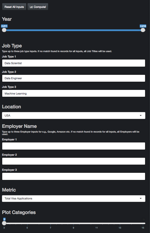
As shown in Figure 1, the input to the app can be provided in the side panel. The app takes multiple inputs from user and provides data visualization corresponding to the related sub-section of the data set. Summary of the inputs:
Year: Slider input of time period. When a single value is chosen, only that year is considered for data analysis.
Job Type: Default inputs are Data Scientist, Data Engineer and Machine Learning. These are selected based on my personal interest. Explore different job titles for e.g. Product Manager, Hardware Engineer. Type up to three job type inputs in the flexible text input. I avoided a drop-down menu as there are thousands of unique Job Titles in the dataset. If no match found in records for all the inputs, all Job Titles in the data subset based on other inputs will be used.
Location: The granularity of the location parameter is State with the default option being the whole of United States.
Employer Name: The default inputs are left blank as that might be the most common use case. Explore data for specific employers for e.g., Google, Amazon etc. Pretty much similar in action to Job Type input.
Metric: The three input metric choices are Total number of H-1B Visa applications, Certified number of Visa Applications and median annual Wage.
UPDATE: Certified applications are filed with USCIS for H-1B approval. CASE_STATUS: CERTIFIED does not mean the applicant got his/her H-1B visa approved, it just means that he/she is eligible to file an H-1B. The random allocation is performed in the next stage by USCIS. For more details on this update, read this discussion on Kaggle. Credits go to Jagan Gurumurthy for figuring this out.
- Plot Categories: Additional control parameter for upper limit on the number of categories to be used for data visualization. Default value is 3 and can be increased up to 15.
App Outputs
Map

As shown in Figure 2, the Map tab outputs a map plot of the metric across the US for the selected inputs. In this case, the map is showing three layers. The first and bottom layer is roughly that of the US map. This is followed by the a point plot of the Metric across different Work sites in US with the bubble size and transparency proportional to the metric value. When only a particular state is selected in the app input instead of the default USA option, then the bubbles appear only for the selected state. The top most layer is that of pointers to the top N work sites with the highest metric values, where N stands for the Plot Categories input.
require(ggmap)
require(ggrepel)
require(dplyr)
require(ggplot2)

USA = map_data(map = "usa")

# Layer 1: USA Map
ggplot(USA, aes(x=long, y=lat)) +
geom_polygon() + xlab("Longitude (deg)") + ylab("Latitude(deg)") +

# Layer 2: Point plot with bubble size directly proportional to metric and
# bubble transparency inversely proportional to metric
geom_point(data=map_df, aes_string(x="lon", y="lat", label = "WORKSITE", alpha = metric, size = metric), color="yellow") +

# Layer 3: Pointer to Top locations. Number of Top selected by Plot Categories Input of the App
geom_label_repel(data=map_df %>% filter(WORKSITE %in% top_locations),aes_string(x="lon", y="lat",label = "WORKSITE"),
                     fontface = 'bold', color = 'black',
                     box.padding = unit(0.0, "lines"),
                     point.padding = unit(1.0, "lines"),
                     segment.color = 'grey50',
                     force = 3) +
# USA Boundaries
coord_map(ylim = c(23,50),xlim=c(-130,-65))
Below the map plot, you can also find the corresponding Data table displaying metrics for all considered work sites. This data table visualization below plot is a common theme across all output tabs of the app.
Job Type

As shown in Figure 3, Job type tab compares the metric for the Job types supplied in the inputs. If none of the inputs match any record in our dataset, then all Job Titles are considered and the top N Job types will be displayed, where N stands for Plot Categories input. You can try this by providing blank inputs to the three Job Type text inputs. This output enables us to explore the Wages and No. of applications for different Job positions for e.g., Software Engineer vs Data Scientist. In the above figure, I am comparing Data Scientist against Data Engineer and Machine Learning positions. We can see an exponential growth in the number of H-1B visa applications for both Data Scientist and Data Engineer roles with Data Scientist picking up the highest growth.
Location

As shown in Figure 4, Location tab compares the metric for the input jobs at different Worksites within the input Location region. In the above figure, the selected input was the default USA. In that case, the app displays the metric for the top N work sites, where N is the Plot Categories input. The top N sites are chosen by looking across all the years in the year range input. In the above example with default job inputs related to Data Science, we clearly observe San Francisco leading the charts closely followed by New York.
Employers

The Employers tab output is similar to the Job Types tab with the only difference being the comparison of employers instead of Job Types. If no Employer inputs are provided or none of the provided match with any records in our dataset then all employers are considered. Figure 5 shows Facebook, Amazon and Microsoft as the leading employers for Data Science positions.
App Hosting
Luckily, shinyapps.io provides a convenient way to deploy your apps online for free. Each user has up to 5 apps they can deploy with limits being 25 hours of active usage per month and 50 app instances running at any time. The deployment and subsequent updates once hosted is made possible using the rsconnect package which requires a one-time sync with your shinyapps.io account.
Coding Hacks
I will briefly discuss a few useful hacks picked up during the creation of this app.
Dropbox rdrop2 package
Initially, when deploying my app, I included the RDS file from which I read my dataset. The file size was ~ 80MB and crashed my app every time it ran. Then, I came across rdrop2 package that allows you to access Dropbox files from the Shiny server thus eliminating the hassle of uploading your dataset with the app bundle. For this to work, all rdrop2 needs is for you to first save the dropbox authentication token as follows:
token <- drop_auth()
saveRDS(token, "droptoken.rds")
# Upload droptoken to your server
# ** Don't share this with anyone **

# You can then revoke the rdrop2 app from your
# dropbox account and start over.
# ******** WARNING ********
# read it back with readRDS
token <- readRDS("droptoken.rds")
# Then pass the token to each drop_ function

#My example
drop_get(path = 'h1b_data/h1b_shiny_compact.rds',
         local_file = 'h1b_shiny_compact.rds',
         dtoken = token,
         overwrite = TRUE,
         progress = TRUE)

# Main data frame for data analysis
h1b_df <- readRDS('h1b_shiny_compact.rds')
Non-standard evaluation
I faced the issue of non-standard-evaluation when I had to pass column names of a dataframe as arguments to a function. lazyeval package came to the rescue. I illustrate a simple example of its usage below.
example <- function(df, column_name, input_vec) {
  # INPUTS:
  # df          : data frame
  # column_name : string value of column name in df
  # input_vec   : character vector of values in column_name of df
  # OUTPUTS:
  # df          : filtered dataframe

  # Main reason for using this is because df$column_name throws
  # error as column_name is not a column in df
  # We need the column_name input to be used

  # Expressing the dplyr statement
  # column_name %in% input_vec using interp
  filter_criteria <- interp(~x %in% y, .values = list(x = as.name(column_name), y = input_vec))

  # filter_ instead of filter
  df %>%
    filter_(filter_criteria) -> df

  return(df)
}
Conclusion
In this blog, I discussed the usage of my Shiny app based on the H-1B visa petition dataset. The app can be accessed at https://sharan-naribole.shinyapps.io/h_1b/. The source code for this app can be found on GitHub.
In my next blog, I will discuss the publication of this dataset in Kaggle’s open data platform and the questions other users seem to be interested in answering from this dataset. Thanks for reading!